When you're totally low on the dough, man, how do you change the look of your pad? How do you bring grooviness and hep jive to your home base? How do you make your bathroom virtually crawl with pattern? Or turn your stately Victorian bath into an abode Mr. Roboto would envy?
This 1971 book I found at the Salvation Army Thrift Store-- "Home Decorating Ideas under $100" was designed to help...
 And actually, there are plenty of good ideas between its pages. Update them from their early 70s styling, and they can be applied nicely for today. And I'll share with you a few of those items right now.
It's the Good ideas that then set us up for the, um, surprises later.
I mean, here, we have a perfectly normal, reasonably tranquil late 60s room...
 The blue and green color combo was so popular at the time. But they combine it with a more neutral gold-beige background, so it doesn't get too overwhelming.
The focal point is a 60s blue-and-green graphic panel of fabric to bring the eye upward. There's a rather gratuitous glass dog on the hearth, but at least he seems happy. Everything seems spacious and well-balanced.
Yes, nothing suspicious here.
Then we have a kitchen, where colorful floral fabric has been used to create interest and update old cabinets.
 The fabric here matches the drapes. But all-in-all, very clean and workable... Nothing eye-poppingly busy. You start to feel almost comfortable with the Better Homes and Gardens people, figuring they must know what they're doing to offer such smart, doable ideas.
And, well...

Okay, so the cabinets covered in cut-out tissue paper flowers above are a bit quirky. And who knows how well they'd hold up to use. But they're cheerful. And what do you expect for ideas under $100?
Okay-dokey, so we move on. To a clever way to display all that popular 70s milkglass...
 The paisley background to the white cabinet sets off the interesting shapes of the milkglass dinner service, so it allows the items to be used decoratively when not actually on the dinner table.
This would really work well with any sort of pattern and color-scheme, and any sort of uniform glassware collection, too.
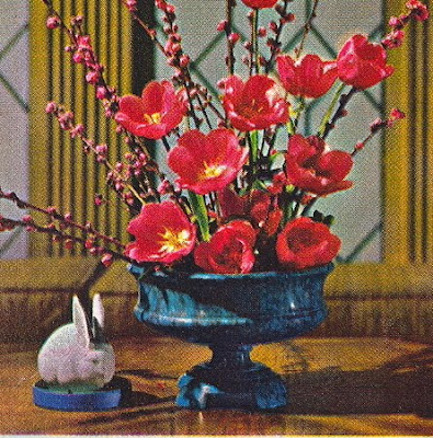
And look, this colorful centerpiece with...
 Er, with...
Well, why is that white rabbit there?

Okay, we'll pay no attention to that random rabbit added into the scene for absolutely no discernible reason. And instead, we'll check out... Um...

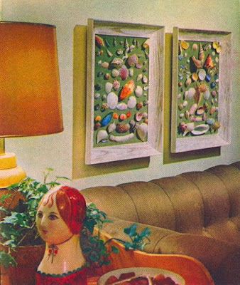
Okay, I know I'm supposed to be paying attention to how they glued shells inexpensively to some board to create instant art. But my eyes keep going over to the disembodied head of the chick in the bonnet...
 What kind of statement are you making when you combine shells with bonneted heads-and-torsos? Are you saying, "Look. I'm earthy and frugal! Also, I have strong negative feelings about the show Gunsmoke"? What would you call this style-- Seaside Pioneer? French Revolution Prairie?
(Shrug)
Then there's this bathroom, that I simply cannot get to scan properly. Why? Because I think the scanner is rebelling in the face of this much pattern in this small of a space...

"It's the wallpaper, with its colorful contemporary design, that makes the small guest powder room come alive. Add to this, a sculptured tin mirror frame, a row of theater lights above it, and unique containers of crystal, silver and bornze, and you have a completely individual retreat for guests."
The walls come alive, all right! And let's just hope none of your guests enjoy refreshments of the narcotic persuasion, or this bathroom might just cause a very bad scene.
"I'm freakin' out, man. The walls see everything and they're comin' for me."
I love how they don't just infest the bathroom with the crawly wall-paper either. They also get a gigantic mirror to reflect the other three walls of it, just in case you missed it when you came in.
Now that's decorating confidence!
But not so confident as this little robotic beauty. Yes, the hills really do have eyes!

"If you have an old-fashioned bathroom of Victorian vintage, flaunt it. The only cost involved in updating the one below was for paint, lumber for a shelf above the bathtub and a wooden theater light frame around the mirror. Use accessories to accent the color of the tub and the wall decorating."If I had a Victorian clawfoot tub, I somehow don't think I would look at it and say to myself:
"Self, you know what this needs? An eight foot tall purple and orange rendering of the robot Gort looming down on me. Yes, nothing says nice, quiet bubble bath time as being watched loofahing by an acrylic invader from another planet."
Oh, Better Home and Gardens people, you were only setting us up with your clever ideas, weren't you, in order to stick it to us later with your budget Borg Invasion.
Ah well...
Yarn flower centerpiece, anyone?...
 Why spend money on fresh flowers, when you could spend money on yarn to make these elegant pom-pom ones?...
Yes, yes, I know. I should have quit when I was ahead.
- If you missed last Sunday's post, about having to adjust even the best laid decorating plans, click here.
Hope you all have a happy week ahead of you, too. And with no robots trying to invade your bathtime.
No comments:
Post a Comment